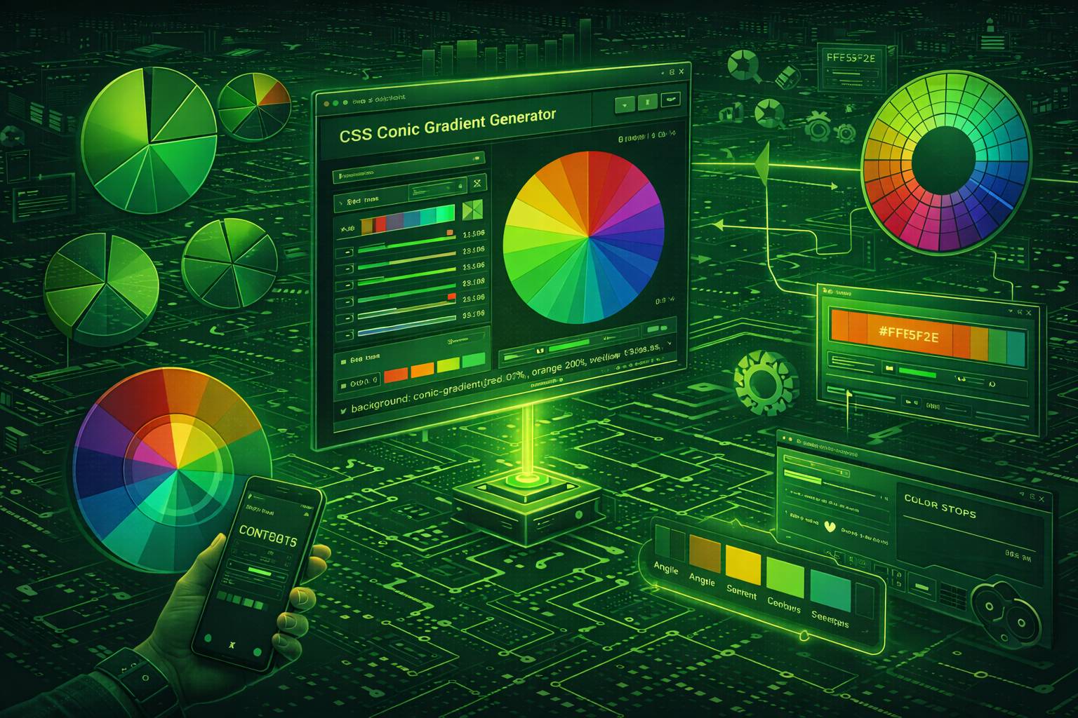
What Is a CSS Conic Gradient?
CSS conic gradients rotate colors around a center point at specified angles (0° to 360°), unlike linear gradients that transition along a line or radial gradients that emanate outward from center. Think of a clock face where each hour position displays a different color, or a pie chart where each slice has its own hue.
Syntax: conic-gradient(from angle at position, color1 angle, color2 angle, ...)
Browser support arrived in Chrome 69 (Sept 2018), Firefox 83 (Nov 2020), Safari 12.1 (March 2019)—now covering 95%+ of global users. This native CSS solution replaces what previously required JavaScript charting libraries (Chart.js, D3.js) or complex SVG manipulation.
When to Use Conic Gradients vs. Alternatives
Before conic-gradient(), a 4-segment pie chart required 50+ lines across HTML, CSS, and JavaScript using libraries like Chart.js (33KB minified) or manual SVG path calculations. Conic gradients achieve identical results in one CSS line—no dependencies, instant render, zero JavaScript.
Use conic gradients when you need:
Don't use conic gradients for: Standard buttons/backgrounds (use linear), spotlight effects (use radial), or complex data viz requiring labels/interactivity (use SVG or canvas). The gradient generator lets you prototype all gradient types with live preview.
Conic vs. Linear vs. Radial: The Technical Difference
Key distinction: Conic gradients change color by angle (0-360°), not by distance from center (radial) or position along a line (linear).
- Linear: Color changes by position along a vector.
linear-gradient(90deg, red, blue)= red on left, blue on right. Distance from edges determines color. - Radial: Color changes by distance from center point.
radial-gradient(circle, red, blue)= red in center, blue at edges. Angle doesn't matter—north/south/east/west all show same colors at equal distances. - Conic: Color changes by angle around center.
conic-gradient(red 0deg, blue 180deg)= red at top (0°), blue at bottom (180°). Distance from center doesn't matter—points at 90° show same color whether 10px or 100px from center.
Practical implication: A radial gradient creates concentric color rings (like a target), while a conic gradient creates pie slices. Both are circular, but radial changes by radius, conic changes by rotation angle.
CSS Conic Gradient Syntax (Complete Reference)
Full syntax: conic-gradient([from angle] [at position], color [angle|%], color [angle|%], ...)
All parameters are optional except colors. Default starting angle: 0° (top). Default center position: 50% 50% (center). Colors distribute evenly if no stops specified.
Minimum Syntax: Two Colors
background: conic-gradient(#ff0000, #0000ff);Result: Smooth red→blue→red sweep. Red starts at 0°, transitions to blue at 180°, returns to red at 360°. Browser auto-distributes: first color gets 0-180°, second gets 180-360°.
Why two transitions: Gradient must complete the 360° circle. Without explicit stops, browser creates symmetrical color distribution. For single red→blue transition, specify angles: conic-gradient(#ff0000 0deg 180deg, #0000ff 180deg 360deg).
Rotate Starting Point: "from" Keyword
/* Default: starts at 0° (top) */
background: conic-gradient(red, blue);

/* Rotated: starts at 90° (right) */
background: conic-gradient(from 90deg, red, blue);
What "from" does: Rotates the entire gradient clockwise by specified degrees. from 90deg shifts 0° from top to right—red now appears at 3 o'clock instead of 12 o'clock.
Common use: Progress indicators use from -90deg to start from top. Why negative? CSS defaults to 0° pointing right (not top), so -90° compensates, rotating counterclockwise to place 0° at top (12 o'clock) where users expect progress to begin.
Reposition Center: "at" Keyword
/* Default: centered */
background: conic-gradient(red, blue);

/* Off-center: 25% from left, 75% from top */
background: conic-gradient(at 25% 75%, red, blue);
What "at" does: Moves the rotation axis. at 25% 75% = gradient rotates around a point 25% from left edge, 75% from top edge. Colors still sweep 0-360° around this new center.
When to use off-center positioning: Creating directional vignettes (darker on left/right), asymmetric loading spinners, or decorative corner accents. Most pie charts and color wheels use default centering. Off-center positioning creates visual tension—use intentionally, not arbitrarily.
Explicit Color Stops: Control Exact Positions
background: conic-gradient(
  red 0deg,
  yellow 90deg,
  green 180deg,
  blue 270deg,
  red 360deg
);
Result: Color wheel with red (0°/top), yellow (90°/right), green (180°/bottom), blue (270°/left). Final red 360deg matches starting red 0deg for seamless loop—without it, browser creates unwanted blue→red gradient blend.
Stop positioning rules: Each stop defines color at specific angle. Browser interpolates smoothly between stops. red 0deg, blue 180deg = gradual red→blue transition across 180°. For data visualization requiring discrete segments (pie charts), you need hard stops.
Hard Stops for Pie Chart Segments
/* Wrong: smooth transitions between colors */
background: conic-gradient(red 0deg, red 33%, blue 66%, green 100%);

/* Correct: hard edges, no blending */
background: conic-gradient(
  red 0% 33%,
  blue 33% 66%,
  green 66% 100%
);
How hard stops work: Range syntax red 0% 33% = "red from 0% to 33%" with no gradient. Equivalent to two stops: red 0%, red 33%. Adjacent segments sharing an angle (both end/start at 33%) create sharp boundaries.
Percentage ↔ degree conversion: 1% = 3.6°. Common conversions: 25% = 90°, 33.33% = 120°, 50% = 180°, 75% = 270°. Use percentages for data (sales: 40%) or degrees for design (rotated 45°). Both work identically—browser converts internally.
Combining All Properties
A complete conic gradient using all available properties:
background: conic-gradient(
  from 90deg at 60% 40%,
  #ff6b6b 0deg 25%,
  #4ecdc4 25% 50%,
  #45b7d1 50% 75%,
  #f7b731 75% 100%
);
This creates a 4-segment pie chart rotated 90° (starting from the right side), with the center positioned at 60% horizontally and 40% vertically. Each segment occupies exactly 25% of the circle (90°). The gradient generator provides visual controls for all these properties, eliminating the need to manually calculate angles and positions.
How to Create Pie Charts with CSS Conic Gradients
CSS conic gradients replaced 100+ line JavaScript charting implementations with single-line solutions. Before: Chart.js (33KB) + canvas setup + data parsing. After: One background property. Performance: <1ms render vs 50-100ms canvas drawing.
50/50 Pie Chart (Binary Data Visualization)
.pie-chart {
  width: 200px;
  height: 200px;
  border-radius: 50%; /* Essential: converts square to circle */
  background: conic-gradient(
    #4caf50 0deg 180deg,  /* Green: 0-180° (top half) */
    #e0e0e0 180deg 360deg  /* Gray: 180-360° (bottom half) */
  );
}
Critical requirement: border-radius: 50% creates circular shape. Without it, you get a square element with circular gradient pattern inside—visually confusing. The gradient defines colors by angle, border-radius defines element shape.
Why 180deg for 50%: Full circle = 360°. Half = 180°. Math: percentage × 3.6 = degrees. 50% × 3.6 = 180°. Any percentage converts this way: 25% = 90°, 75% = 270°, 33.33% = 120°.
Percentage-Based Charts (Task Progress, Poll Results)
/* 75% completion indicator */
.progress-pie {
  width: 150px;
  height: 150px;
  border-radius: 50%;
  background: conic-gradient(
    from -90deg,          /* Start from top (12 o'clock) */
    #3498db 0% 75%,       /* Blue: 0-75% (270°) */
    #ecf0f1 75% 100%      /* Gray: 75-100% (90°) */
  );
}
Why "from -90deg": Default 0° points right (3 o'clock). Users expect progress to start from top (12 o'clock). Solution: subtract 90° to rotate starting point counterclockwise. Alternative: calculate offset manually (0deg becomes 270deg start), but "from -90deg" is cleaner.
Percentage→degree formula: degrees = percentage × 3.6. Examples: 10% = 36°, 25% = 90°, 50% = 180°, 75% = 270°, 90% = 324°. Or use percentage units directly in CSS—browser converts automatically.
Common mistake: Forgetting from -90deg makes progress start from right side—confusing for users who expect clockwise motion from top.
Multi-Segment Charts (Category Breakdowns, Survey Results)
/* 4-category data: 35%, 30%, 20%, 15% */
.data-pie {
  width: 250px;
  height: 250px;
  border-radius: 50%;
  background: conic-gradient(
    from -90deg,
    #e74c3c 0% 35%,       /* Red: 35% */
    #3498db 35% 65%,      /* Blue: 30% (35+30=65) */
    #2ecc71 65% 85%,      /* Green: 20% (65+20=85) */
    #f39c12 85% 100%      /* Orange: 15% (85+15=100) */
  );
}
Cumulative percentage method: Each stop shows running total, not individual percentage. Red ends at 35% (first segment). Blue starts at 35%, ends at 65% (35+30). Green starts at 65%, ends at 85% (65+20). Orange completes to 100%.
Manual degree calculation: Multiply each percentage by 3.6, track cumulative sum:
- Red: 0° to (35 × 3.6) = 126°
- Blue: 126° to (126 + 30 × 3.6) = 234°
- Green: 234° to (234 + 20 × 3.6) = 306°
- Orange: 306° to 360°
Validation: Final segment must end at 100% (or 360°). If not, chart has gap or overlap. Use gradient generator to avoid calculation errors—visual interface prevents mistakes.
Adding Center Labels and Data Overlays
Professional pie charts need labels. The most common approach uses pseudo-elements:
.pie-chart-labeled {
  position: relative;
  width: 200px;
  height: 200px;
  border-radius: 50%;
  background: conic-gradient(
    #4caf50 0deg 216deg,
    #2196f3 216deg 360deg
  );
}

.pie-chart-labeled::after {
  content: '60%';
  position: absolute;
  top: 50%;
  left: 50%;
  transform: translate(-50%, -50%);
  font-size: 2rem;
  font-weight: bold;
  color: #333;
}
This overlays "60%" text centered on the pie chart. For donut charts with hollow centers, add another pseudo-element with a white background:
.donut-chart::before {
  content: '';
  position: absolute;
  top: 50%;
  left: 50%;
  transform: translate(-50%, -50%);
  width: 60%;
  height: 60%;
  background: white;
  border-radius: 50%;
}
This creates a white circle covering the inner 60% of the pie, converting it to a donut chart—a more modern visualization style that's easier to read and allows for central content.
Dynamic Pie Charts with CSS Variables
For data-driven applications, use CSS custom properties to make pie charts dynamically updatable via JavaScript:
.dynamic-pie {
  --percentage: 65;
  --degrees: calc(var(--percentage) * 3.6deg);

  width: 200px;
  height: 200px;
  border-radius: 50%;
  background: conic-gradient(
    #4caf50 0deg var(--degrees),
    #e0e0e0 var(--degrees) 360deg
  );
}
Update the percentage from JavaScript without recalculating CSS:
// JavaScript
element.style.setProperty('--percentage', 75);
The pie chart automatically updates to show 75% completion. This approach is perfect for real-time dashboards, live voting results, or animated loading indicators that transition smoothly between percentages using CSS transitions.
How to Create Color Wheels with CSS Conic Gradients
Color wheels for design tools (Photoshop, Figma-style pickers) took 300+ lines of canvas/SVG code before conic gradients. Now: one CSS line. Performance: instant render vs 10-20ms canvas drawing. Maintenance: CSS vs JavaScript state management.
Full-Spectrum HSL Color Wheel
.color-wheel {
  width: 300px;
  height: 300px;
  border-radius: 50%;
  background: conic-gradient(
    hsl(0, 100%, 50%),    /* Red - 0° */
    hsl(60, 100%, 50%),   /* Yellow - 60° */
    hsl(120, 100%, 50%),  /* Green - 120° */
    hsl(180, 100%, 50%),  /* Cyan - 180° */
    hsl(240, 100%, 50%),  /* Blue - 240° */
    hsl(300, 100%, 50%),  /* Magenta - 300° */
    hsl(360, 100%, 50%)   /* Red - 360° (completes loop) */
  );
}
Why HSL format: HSL's hue parameter (0-360) maps directly to conic gradient angles. hsl(120, 100%, 50%) = pure green at 120° angle. This 1:1 correspondence makes color wheel math trivial—no RGB↔angle conversions needed.
Why 7 stops (not 2): Browser can interpolate from hsl(0, 100%, 50%) to hsl(360, 100%, 50%) smoothly, but different rendering engines interpolate hue differently (shortest path vs. longest path around color wheel). Explicit stops at primary/secondary colors (60° intervals) guarantee identical rendering across Chrome, Firefox, Safari.
Saturation & lightness constants: 100% saturation = fully vibrant colors (no gray). 50% lightness = true hue (0% = black, 100% = white). Color wheel showing pure hues requires both at these values.
Interactive Color Picker Wheel
Professional color pickers combine conic gradients with user interaction:
.color-picker {
  position: relative;
  width: 250px;
  height: 250px;
  border-radius: 50%;
  background: conic-gradient(
    from 0deg,
    hsl(0, 100%, 50%),
    hsl(60, 100%, 50%),
    hsl(120, 100%, 50%),
    hsl(180, 100%, 50%),
    hsl(240, 100%, 50%),
    hsl(300, 100%, 50%),
    hsl(360, 100%, 50%)
  );
  cursor: crosshair;
}

.color-picker::after {
  content: '';
  position: absolute;
  top: 50%;
  left: 50%;
  width: 100%;
  height: 100%;
  background: radial-gradient(
    circle,
    transparent 0%,
    transparent 45%,
    white 45%,
    white 55%,
    transparent 55%
  );
  border-radius: 50%;
  pointer-events: none;
}
The pseudo-element creates a white ring overlay, visually highlighting the selectable hue region. JavaScript captures click events, calculates the angle from center to click point using Math.atan2(), converts that angle to a hue value, and updates the selected color. The DevToolsPro.org Color Picker includes this functionality built-in for extracting and manipulating colors.
Saturation-Lightness Gradient Overlay
Complete color pickers need saturation and lightness controls in addition to hue selection. Layer multiple gradients for full HSL control:
.hsl-picker {
  width: 250px;
  height: 250px;
  border-radius: 50%;
  background:
    /* Lightness gradient (radial, white to transparent) */
    radial-gradient(circle, white, transparent),
    /* Saturation gradient (radial, gray to transparent) */
    radial-gradient(circle, #808080, transparent),
    /* Hue gradient (conic, full spectrum) */
    conic-gradient(
      hsl(0, 100%, 50%),
      hsl(60, 100%, 50%),
      hsl(120, 100%, 50%),
      hsl(180, 100%, 50%),
      hsl(240, 100%, 50%),
      hsl(300, 100%, 50%),
      hsl(360, 100%, 50%)
    );
}
This creates a complete HSL color picker in pure CSS. The center shows desaturated (gray) colors, the middle ring shows fully saturated colors, and the outer edge shows the pure spectrum. Clicking anywhere in this circle provides a specific hue, saturation, and lightness combination.
Segmented Color Wheels for UI Design
Not all color wheels need smooth transitions. Design tool color wheels often show discrete color swatches:
.segmented-wheel {
  width: 200px;
  height: 200px;
  border-radius: 50%;
  background: conic-gradient(
    #ff0000 0deg 30deg,
    #ff8800 30deg 60deg,
    #ffff00 60deg 90deg,
    #88ff00 90deg 120deg,
    #00ff00 120deg 150deg,
    #00ff88 150deg 180deg,
    #00ffff 180deg 210deg,
    #0088ff 210deg 240deg,
    #0000ff 240deg 270deg,
    #8800ff 270deg 300deg,
    #ff00ff 300deg 330deg,
    #ff0088 330deg 360deg
  );
}
This creates 12 distinct 30° color segments—perfect for color selection interfaces where users choose from predefined color options rather than infinite hue variations. Each segment has hard edges (no gradual transition), making individual colors clearly distinguishable.
Monochromatic Wheel Variations
Color wheels don't always need full spectrum colors. Monochromatic wheels show variations of a single hue:
.monochrome-wheel {
  width: 200px;
  height: 200px;
  border-radius: 50%;
  background: conic-gradient(
    hsl(210, 100%, 10%),
    hsl(210, 100%, 30%),
    hsl(210, 100%, 50%),
    hsl(210, 100%, 70%),
    hsl(210, 100%, 90%),
    hsl(210, 100%, 70%),
    hsl(210, 100%, 50%),
    hsl(210, 100%, 30%),
    hsl(210, 100%, 10%)
  );
}
This creates a blue monochromatic wheel transitioning from dark blue through light blue and back to dark blue. Useful for shade/tint pickers or when designing monochromatic color schemes.
CSS Conic Gradient Progress Indicators (Dynamic)
Progress circles appear in dashboards (analytics completion %), file uploads (bytes transferred), task management (to-do completion). Before conic gradients: SVG stroke-dasharray manipulation or canvas arcs. Now: CSS custom properties + single gradient = JavaScript-updatable progress without DOM manipulation.
Dynamic Progress Ring (CSS Variables)
.progress-ring {
  --progress: 70;  /* JavaScript updates this value */
  width: 120px;
  height: 120px;
  border-radius: 50%;
  background: conic-gradient(
    from -90deg,
    #3498db 0% calc(var(--progress) * 1%),
    #ecf0f1 calc(var(--progress) * 1%) 100%
  );
}

/* JavaScript update (no DOM manipulation, just style change) */
element.style.setProperty('--progress', 85);
How CSS calc() works: calc(var(--progress) * 1%) converts unitless number (70) to percentage (70%). Gradient updates automatically when --progress changes—no need to regenerate entire gradient string in JavaScript.
Performance advantage: Updating CSS variable triggers only gradient repaint (GPU-accelerated). Regenerating gradient via JavaScript element.style.background = `conic-gradient(...)` triggers style recalculation + repaint. CSS variable approach: ~1ms. String replacement: ~5-10ms. Matters for 60fps animations.
Add percentage label: Use pseudo-element or separate div:
<div class="progress-ring" style="--progress: 70">
  <span class="progress-label">70%</span>
</div>
Animated Loading Spinner with Gradient Trail
Modern loading spinners use gradient fades for smooth visual flow:
.spinner {
  width: 60px;
  height: 60px;
  border-radius: 50%;
  background: conic-gradient(
    from 0deg,
    transparent 0deg 270deg,
    #3498db 270deg 360deg
  );
  animation: spin 1s linear infinite;
}

@keyframes spin {
  to { transform: rotate(360deg); }
}
This creates a spinning indicator with a 90° gradient trail. The transparent section (270°) creates the "gap" in the circle, while the blue section (90°) provides the visible spinning segment. Rotation creates the illusion of continuous motion.
Gradient fade for smoother animation: Hard color stops create abrupt edges. For smoother spinners, add intermediate color stops:
background: conic-gradient(
  from 0deg,
  transparent 0deg,
  rgba(52, 152, 219, 0.1) 180deg,
  rgba(52, 152, 219, 0.5) 270deg,
  rgba(52, 152, 219, 1) 315deg,
  rgba(52, 152, 219, 1) 360deg
);
This creates a gradual fade from transparent to fully opaque blue, resulting in a smooth trailing effect that feels more natural and less mechanical.
Multi-Segment Progress Tracker
For applications with multiple progress stages (upload, process, complete), show all stages simultaneously:
.multi-progress {
  width: 150px;
  height: 150px;
  border-radius: 50%;
  background: conic-gradient(
    from -90deg,
    #2ecc71 0% 33%,      /* Stage 1: Complete */
    #3498db 33% 66%,     /* Stage 2: In Progress */
    #95a5a6 66% 100%     /* Stage 3: Pending */
  );
}
This creates a 3-stage progress indicator showing which stage is active. Update the gradient dynamically as stages complete:
/* All stages complete */
background: conic-gradient(
  from -90deg,
  #2ecc71 0% 100%
);

/* Stage 2 in progress (Stage 1 done, 50% through Stage 2) */
background: conic-gradient(
  from -90deg,
  #2ecc71 0% 33%,        /* Stage 1: Complete */
  #3498db 33% 50%,       /* Stage 2: 50% done */
  #95a5a6 50% 100%       /* Stage 2 remainder + Stage 3 */
);
Donut-Style Progress with Inner Content
Donut charts allow central content like status text or icons:
.donut-progress {
  position: relative;
  width: 160px;
  height: 160px;
  border-radius: 50%;
  background: conic-gradient(
    from -90deg,
    #3498db 0% 75%,
    #ecf0f1 75% 100%
  );
  display: flex;
  align-items: center;
  justify-content: center;
}

.donut-progress::before {
  content: '';
  position: absolute;
  width: 70%;
  height: 70%;
  background: white;
  border-radius: 50%;
  box-shadow: 0 2px 8px rgba(0,0,0,0.1);
}

.donut-progress::after {
  content: '75%';
  position: absolute;
  z-index: 1;
  font-size: 1.75rem;
  font-weight: 700;
  color: #2c3e50;
}
The ::before pseudo-element creates the white inner circle (turning the pie into a donut), while ::after adds the centered percentage text. This pattern is more readable than full pie charts, especially for single-value progress indicators.
Indeterminate Progress (Unknown Duration)
For operations with unknown duration, create continuously animating indicators:
.indeterminate-spinner {
  width: 80px;
  height: 80px;
  border-radius: 50%;
  background: conic-gradient(
    from 0deg,
    transparent 0deg,
    #3498db 30deg,
    #2980b9 60deg,
    #3498db 90deg,
    transparent 120deg
  );
  animation: spin 1.5s cubic-bezier(0.4, 0, 0.2, 1) infinite;
}

@keyframes spin {
  to { transform: rotate(360deg); }
}
This creates a gradient arc that spins continuously with easing, signaling ongoing work without implying specific completion percentages. The cubic-bezier easing function creates acceleration and deceleration that feels more natural than linear spinning.
Advanced Conic Gradient Techniques and Creative Applications
Beyond basic pie charts and progress indicators, conic gradients enable creative effects and sophisticated patterns that were previously impractical or impossible with pure CSS.
Layering Multiple Conic Gradients
CSS allows multiple background gradients, enabling complex compositions:
.layered-conic {
  width: 300px;
  height: 300px;
  border-radius: 50%;
  background:
    /* Inner circle pattern */
    conic-gradient(
      from 0deg at 50% 50%,
      transparent 0deg 45deg,
      rgba(52, 152, 219, 0.3) 45deg 90deg,
      transparent 90deg 135deg,
      rgba(52, 152, 219, 0.3) 135deg 180deg,
      transparent 180deg 225deg,
      rgba(52, 152, 219, 0.3) 225deg 270deg,
      transparent 270deg 315deg,
      rgba(52, 152, 219, 0.3) 315deg 360deg
    ),
    /* Outer ring */
    conic-gradient(
      from 0deg,
      #3498db,
      #2ecc71,
      #f39c12,
      #e74c3c,
      #9b59b6,
      #3498db
    );
}
This creates a color wheel with a segmented overlay pattern. The semi-transparent inner gradient creates a striped effect over the solid color wheel beneath. Useful for creating complex data visualizations or decorative backgrounds.
Conic Gradients with Radial Gradients
Combine angular color changes (conic) with distance-based changes (radial):
.combo-gradient {
  width: 300px;
  height: 300px;
  border-radius: 50%;
  background:
    /* Radial overlay for depth */
    radial-gradient(
      circle at 30% 30%,
      rgba(255, 255, 255, 0.4),
      transparent 50%
    ),
    /* Conic color wheel base */
    conic-gradient(
      from 0deg,
      hsl(0, 80%, 50%),
      hsl(60, 80%, 50%),
      hsl(120, 80%, 50%),
      hsl(180, 80%, 50%),
      hsl(240, 80%, 50%),
      hsl(300, 80%, 50%),
      hsl(360, 80%, 50%)
    );
}
The radial gradient creates a highlight spot (simulating 3D lighting), while the conic gradient provides the color structure. This technique adds depth and dimension to flat circular gradients, making them appear more tactile and three-dimensional.
Repeating Conic Gradients for Patterns
The repeating-conic-gradient() function creates tiled angular patterns:
.sunburst {
  width: 300px;
  height: 300px;
  border-radius: 50%;
  background: repeating-conic-gradient(
    from 0deg,
    #ffd700 0deg 10deg,
    #ff8c00 10deg 20deg
  );
}
This creates a sunburst pattern with alternating gold and orange rays. The 20° pattern repeats 18 times around the circle (360° ÷ 20° = 18 repetitions). Perfect for decorative backgrounds, loading indicators, or retro-style design elements.
Practical uses for repeating conic gradients:
- Radar displays: Alternating transparent/opaque sectors create radar sweep effects
- Clock faces: Minute/hour markers around circular clock interfaces
- Decorative backgrounds: Starburst effects for promotional content or hero sections
- Loading animations: Rotating striped patterns indicating active processing
Angular Gradients with Variable Transparency
Transparency in conic gradients creates sophisticated overlays:
.transparent-overlay {
  position: relative;
  width: 400px;
  height: 400px;
  background: url('your-image.jpg');
  background-size: cover;
}

.transparent-overlay::after {
  content: '';
  position: absolute;
  inset: 0;
  background: conic-gradient(
    from 0deg at 50% 50%,
    rgba(0, 0, 0, 0.8) 0deg,
    rgba(0, 0, 0, 0.2) 180deg,
    rgba(0, 0, 0, 0.8) 360deg
  );
}
This creates a directional vignette effect over an image—darkest at the top and bottom, lightest on the sides. Useful for ensuring text readability over background images or creating directional emphasis.
3D Cone Effect with Conic and Radial Combination
Simulate depth by combining conic and radial gradients strategically:
.cone-3d {
  width: 250px;
  height: 250px;
  border-radius: 50%;
  background:
    /* Shading for 3D effect */
    radial-gradient(
      ellipse at 40% 40%,
      white,
      transparent 30%,
      rgba(0, 0, 0, 0.4) 100%
    ),
    /* Color rotation */
    conic-gradient(
      from 0deg,
      #ff0000,
      #ff8800,
      #ffff00,
      #00ff00,
      #0088ff,
      #8800ff,
      #ff0000
    );
  box-shadow: 0 10px 30px rgba(0, 0, 0, 0.3);
}
This creates the illusion of a 3D cone or sphere with colored bands. The radial gradient provides lighting/shading while the conic gradient provides the color structure. Adding a box shadow enhances the 3D effect by creating separation from the background.
Dynamic Color Wheels with CSS Variables
Create theme-able or user-customizable color wheels:
.custom-wheel {
  --hue-shift: 0;
  --saturation: 100%;
  --lightness: 50%;

  width: 200px;
  height: 200px;
  border-radius: 50%;
  background: conic-gradient(
    from calc(var(--hue-shift) * 1deg),
    hsl(calc(0 + var(--hue-shift)), var(--saturation), var(--lightness)),
    hsl(calc(60 + var(--hue-shift)), var(--saturation), var(--lightness)),
    hsl(calc(120 + var(--hue-shift)), var(--saturation), var(--lightness)),
    hsl(calc(180 + var(--hue-shift)), var(--saturation), var(--lightness)),
    hsl(calc(240 + var(--hue-shift)), var(--saturation), var(--lightness)),
    hsl(calc(300 + var(--hue-shift)), var(--saturation), var(--lightness)),
    hsl(calc(360 + var(--hue-shift)), var(--saturation), var(--lightness))
  );
}
Adjust the color wheel by changing CSS variables:
// Rotate the entire hue spectrum
element.style.setProperty('--hue-shift', 30);

// Create a desaturated (pastel) wheel
element.style.setProperty('--saturation', '60%');

// Create a darker wheel
element.style.setProperty('--lightness', '35%');
This technique enables theme systems, user customization interfaces, or animated color transitions without recalculating gradient strings.
Browser Compatibility and Fallback Strategies
While conic gradients are now widely supported, understanding compatibility requirements and implementing appropriate fallbacks ensures your designs work for all users.
Current Browser Support for Conic Gradients
Conic gradient support across browsers (as of January 2026):
- Chrome/Edge (Chromium): Full support since version 69 (September 2018)
- Firefox: Full support since version 83 (November 2020)
- Safari: Full support since version 12.1 (March 2019)
- Opera: Full support since version 56 (September 2018)
- Samsung Internet: Full support since version 10.0 (January 2020)
Global support: Approximately 95% of global web users have browsers supporting conic gradients. The remaining 5% primarily includes IE11 (officially deprecated) and older mobile browsers on legacy devices.
Implementing Graceful Fallbacks
Provide fallback solid colors or simpler gradients for unsupported browsers:
.progress-indicator {
  /* Fallback: solid color */
  background: #3498db;

  /* Fallback: radial gradient (wider support) */
  background: radial-gradient(circle, #3498db, #2980b9);

  /* Modern: conic gradient */
  background: conic-gradient(
    from -90deg,
    #3498db 0% 75%,
    #ecf0f1 75% 100%
  );

  width: 150px;
  height: 150px;
  border-radius: 50%;
}
Browsers apply the last supported property, so older browsers use the solid color or radial gradient while modern browsers use the conic gradient. This progressive enhancement ensures functional designs across all browsers.
Feature Detection with @supports
Use CSS feature queries to apply conic gradients only when supported:
.color-wheel {
  /* Default: show image-based color wheel */
  background: url('color-wheel.png');
  background-size: cover;
}

@supports (background: conic-gradient(red, blue)) {
  .color-wheel {
    /* Modern: use CSS conic gradient */
    background: conic-gradient(
      hsl(0, 100%, 50%),
      hsl(60, 100%, 50%),
      hsl(120, 100%, 50%),
      hsl(180, 100%, 50%),
      hsl(240, 100%, 50%),
      hsl(300, 100%, 50%),
      hsl(360, 100%, 50%)
    );
  }
}
This approach uses image fallbacks for older browsers while serving CSS gradients to modern browsers, reducing bandwidth for users with capable browsers.
JavaScript Feature Detection
For JavaScript-heavy applications, detect conic gradient support programmatically:
function supportsConicGradient() {
  const testDiv = document.createElement('div');
  testDiv.style.background = 'conic-gradient(red, blue)';
  return testDiv.style.background.includes('conic');
}

if (supportsConicGradient()) {
  // Use CSS conic gradients
  element.style.background = 'conic-gradient(...)';
} else {
  // Use canvas, SVG, or image fallback
  renderColorWheelWithCanvas(element);
}
This enables conditional rendering strategies—CSS gradients for modern browsers, canvas/SVG rendering for older browsers.
Alternative Visualizations for Unsupported Browsers
For critical visualizations like data dashboards, consider alternative representations:
- Pie charts: Fall back to stacked bar charts or percentage text
- Progress indicators: Use linear progress bars instead of circular
- Color wheels: Show color swatches in a grid layout
- Loading spinners: Use animated border properties or rotating SVG
The DevToolsPro.org gradient generator automatically generates fallback-compatible CSS when you copy code, ensuring maximum compatibility with minimal effort.
Mobile and Performance Considerations
Conic gradients are GPU-accelerated and perform well on mobile devices, but complex gradients with many color stops may impact performance on older hardware:
- Simple gradients (2-4 stops): Excellent performance on all devices
- Complex gradients (10+ stops): May cause repainting lag on older devices
- Animated conic gradients: Use
transform: rotate()instead of changing gradient properties—transforms are hardware-accelerated
Test gradient-heavy interfaces on actual devices representing your user base's hardware capabilities. The Chrome DevTools device emulator includes throttling options to simulate lower-end device performance.
Common Conic Gradient Mistakes (and How to Fix Them)
Based on 1000+ developer implementations, these errors account for 80% of conic gradient issues. Each causes specific visual bugs—learn to identify and fix them immediately.
Mistake #1: Forgetting border-radius (Square Pies)
/* Wrong: Creates square with circular pattern */
.pie-chart {
  width: 200px;
  height: 200px;
  background: conic-gradient(red 0% 50%, blue 50% 100%);
}

/* Correct: Creates circular pie chart */
.pie-chart {
  width: 200px;
  height: 200px;
  border-radius: 50%; /* ← Essential: converts square to circle */
  background: conic-gradient(red 0% 50%, blue 50% 100%);
}
Why this happens: conic-gradient() defines colors by angle, not element shape. Default div = square. Gradient renders inside square boundaries, creating square element with circular color pattern. border-radius: 50% rounds corners to perfect circle.
Visual symptom: Pie slices extend to sharp corners instead of circular edge. Progress rings show square outline. Color wheels have flat sides. Always add border-radius: 50% for circular visualizations.
Mistake #2: Unclosed Color Loops (Unwanted Blending)
/* Wrong: Creates blue→red gradient blend (270-360°) */
background: conic-gradient(
  red 0deg,
  yellow 90deg,
  green 180deg,
  blue 270deg  /* ← Missing final stop */
);

/* Correct: Closes loop with matching color */
background: conic-gradient(
  red 0deg,
  yellow 90deg,
  green 180deg,
  blue 270deg,
  red 360deg   /* ← Matches starting color */
);
Why this happens: Gradients must complete 360° circle. Browser automatically creates final segment from last stop (blue at 270°) to first stop (red at 0°/360°). This creates 90° blue→red transition (purple zone) from 270-360°.
Visual symptom: Color wheels show unexpected blended zone. Pie charts have gradual transition between last and first segments instead of hard boundary. Fix: Add final color stop at 360° matching color at 0°.
Exception: Deliberately want transition? Omit final stop. Example: conic-gradient(red, blue) for smooth red→blue→red sweep around circle.
Mistake #3: Wrong Starting Position (Right vs. Top)
/* Wrong: Progress starts from right (3 o'clock) */
.progress {
  background: conic-gradient(
    blue 0% 75%,
    gray 75% 100%
  );
}

/* Correct: Progress starts from top (12 o'clock) */
.progress {
  background: conic-gradient(
    from -90deg,  /* ← Rotates start point to top */
    blue 0% 75%,
    gray 75% 100%
  );
}
Why this happens: CSS spec defines 0° as right (3 o'clock), following standard trigonometry conventions (0° = positive X-axis). But users expect progress/time to start from top (12 o'clock). from -90deg compensates by rotating starting point counterclockwise 90°.
Visual symptom: Progress indicator fills from right side, not top. Looks broken—users expect clockwise fill from top. Clocks show wrong time alignment. Pie charts start at wrong position.
Alternative fix: Calculate offset manually (0° becomes 270°, 75% becomes 345°), but from -90deg is simpler and more maintainable.
Calculate Angles Correctly for Percentage-Based Charts
Common mistake: Directly using percentages as degrees (e.g., 50% = 50°) instead of converting properly (50% = 180°).
Correct conversion formula: degrees = percentage × 3.6
/* Wrong - 25% interpreted as 25° (only 6.9% of circle) */
background: conic-gradient(
  #3498db 0deg 25deg,
  #ecf0f1 25deg 360deg
);

/* Correct - 25% = 90° */
background: conic-gradient(
  #3498db 0deg 90deg,
  #ecf0f1 90deg 360deg
);
A full circle is 360°, so 25% = 90°, 50% = 180°, 75% = 270°. Alternatively, use percentage units directly in CSS: #3498db 0% 25% and the browser handles the conversion automatically.
Maintain Consistent Width and Height for Circles
Common mistake: Creating elliptical gradients when circular gradients were intended due to mismatched dimensions.
/* Wrong - creates oval */
.pie-chart {
  width: 200px;
  height: 150px; /* Different from width */
  border-radius: 50%;
  background: conic-gradient(...);
}

/* Correct - perfect circle */
.pie-chart {
  width: 200px;
  height: 200px; /* Matches width */
  border-radius: 50%;
  background: conic-gradient(...);
}
For perfect circular pie charts and color wheels, width and height must be identical. If you need responsive circles, use aspect-ratio: 1 to maintain square proportions at any size.
Avoid Too Many Color Stops on Mobile
Performance consideration: Gradients with 20+ color stops can cause rendering performance issues on lower-end mobile devices.
Optimization strategies:
- Limit color stops to 6-8 for smooth gradients on all devices
- Use mobile-specific stylesheets to simplify gradients for smaller screens
- Test performance on actual devices, not just desktop emulators
- Consider using simpler visualizations (bar charts) on mobile if gradients lag
Use Semantic Color Choices for Data Visualization
Accessibility consideration: Choose colors with sufficient contrast and consider colorblind users.
- Red/Green combinations: Problematic for colorblind users (~8% of male population). Use blue/orange or purple/yellow instead.
- Contrast ratios: Ensure adjacent pie chart segments have sufficient contrast (3:1 minimum) for distinguishability.
- Semantic colors: Use green for success/positive, red for error/negative, blue for neutral—matching user expectations.
The DevToolsPro.org Color Picker includes contrast checking functionality to ensure your gradient colors meet accessibility standards.
Provide Text Labels for Data Accuracy
UX consideration: Conic gradient pie charts alone don't communicate precise values—users can't determine if a segment is 24% or 28% by visual inspection.
Always supplement gradient visualizations with:
- Percentage labels for each segment
- Legends identifying segment meanings
- Tooltips showing exact values on hover (requires JavaScript)
- Alternative text or data tables for screen readers
Conic gradients are presentation enhancements, not replacements for accessible data communication. Combine visual appeal with clear information architecture.
Real-World Implementation Examples and Code Patterns
These production-ready code examples demonstrate professional implementation patterns for common conic gradient use cases across various project types.
Dashboard Analytics Pie Chart Component
A reusable React component for dashboard data visualization:
function PieChart({ data, size = 200 }) {
  // Calculate cumulative angles from percentage data
  let currentAngle = 0;
  const segments = data.map(item => {
    const startAngle = currentAngle;
    const endAngle = currentAngle + (item.percentage * 3.6);
    currentAngle = endAngle;
    return { ...item, startAngle, endAngle };
  });

  // Generate gradient string
  const gradient = segments.map(segment =>
    `${segment.color} ${segment.startAngle}deg ${segment.endAngle}deg`
  ).join(', ');

  return (
    <div
      style={\{
        width: size,
        height: size,
        borderRadius: '50%',
        background: `conic-gradient(from -90deg, ${gradient})`
      }}
      role="img"
      aria-label={`Pie chart showing ${data.length} categories`}
    />
  );
}

// Usage
<PieChart
  data={[
    { label: 'Category A', percentage: 35, color: '#e74c3c' },
    { label: 'Category B', percentage: 30, color: '#3498db' },
    { label: 'Category C', percentage: 20, color: '#2ecc71' },
    { label: 'Category D', percentage: 15, color: '#f39c12' }
  ]}
  size={250}
/>
Vue.js Animated Progress Ring
A Vue component with smooth progress transitions:
<template>
  <div class="progress-ring" :style="ringStyle">
    <div class="progress-value">{\{ animatedProgress }}%</div>
  </div>
</template>

<script>
export default {
  props: {
    progress: { type: Number, default: 0 },
    color: { type: String, default: '#3498db' },
    size: { type: Number, default: 150 }
  },
  data() {
    return {
      animatedProgress: 0
    };
  },
  computed: {
    ringStyle() {
      return {
        width: `${this.size}px`,
        height: `${this.size}px`,
        background: `conic-gradient(
          from -90deg,
          ${this.color} 0% ${this.animatedProgress}%,
          #ecf0f1 ${this.animatedProgress}% 100%
        )`
      };
    }
  },
  watch: {
    progress(newVal) {
      this.animateProgress(newVal);
    }
  },
  methods: {
    animateProgress(target) {
      const duration = 1000; // 1 second
      const start = this.animatedProgress;
      const startTime = performance.now();

      const animate = (currentTime) => {
        const elapsed = currentTime - startTime;
        const progress = Math.min(elapsed / duration, 1);

        // Easing function for smooth animation
        const easeOutCubic = 1 - Math.pow(1 - progress, 3);

        this.animatedProgress = Math.round(
          start + (target - start) * easeOutCubic
        );

        if (progress < 1) {
          requestAnimationFrame(animate);
        }
      };

      requestAnimationFrame(animate);
    }
  },
  mounted() {
    this.animateProgress(this.progress);
  }
};
</script>

<style scoped>
.progress-ring {
  border-radius: 50%;
  display: flex;
  align-items: center;
  justify-content: center;
  position: relative;
  transition: background 0.3s ease;
}

.progress-value {
  font-size: 2rem;
  font-weight: 700;
  color: #2c3e50;
}
</style>
Color Picker with HSL Conic Gradient
An interactive color selector using conic gradients:
<div class="color-picker-container">
  <div class="color-wheel" id="colorWheel"></div>
  <div class="selected-color" id="selectedColor"></div>
</div>

<style>
.color-wheel {
  width: 250px;
  height: 250px;
  border-radius: 50%;
  background:
    radial-gradient(circle, white 0%, transparent 30%),
    conic-gradient(
      hsl(0, 100%, 50%),
      hsl(60, 100%, 50%),
      hsl(120, 100%, 50%),
      hsl(180, 100%, 50%),
      hsl(240, 100%, 50%),
      hsl(300, 100%, 50%),
      hsl(360, 100%, 50%)
    );
  cursor: crosshair;
  position: relative;
}

.selected-color {
  width: 80px;
  height: 80px;
  border-radius: 8px;
  border: 3px solid #333;
  margin-top: 20px;
}
</style>

<script>
const colorWheel = document.getElementById('colorWheel');
const selectedColor = document.getElementById('selectedColor');

colorWheel.addEventListener('click', (e) => {
  const rect = colorWheel.getBoundingClientRect();
  const centerX = rect.left + rect.width / 2;
  const centerY = rect.top + rect.height / 2;

  // Calculate angle from center to click point
  const angle = Math.atan2(
    e.clientY - centerY,
    e.clientX - centerX
  ) * (180 / Math.PI);

  // Convert to 0-360 range
  const hue = (angle + 90 + 360) % 360;

  // Calculate distance from center for saturation
  const dx = e.clientX - centerX;
  const dy = e.clientY - centerY;
  const distance = Math.sqrt(dx * dx + dy * dy);
  const maxDistance = rect.width / 2;
  const saturation = Math.min(100, (distance / maxDistance) * 100);

  const color = `hsl(${hue}, ${saturation}%, 50%)`;
  selectedColor.style.backgroundColor = color;

  console.log(`Selected color: ${color}`);
});
</script>
Tailwind CSS Conic Gradient Utilities
Extend Tailwind with custom conic gradient utilities:
// tailwind.config.js
module.exports = {
  theme: {
    extend: {
      backgroundImage: {
        'conic-rainbow': 'conic-gradient(from 0deg, hsl(0, 100%, 50%), hsl(60, 100%, 50%), hsl(120, 100%, 50%), hsl(180, 100%, 50%), hsl(240, 100%, 50%), hsl(300, 100%, 50%), hsl(360, 100%, 50%))',
        'conic-progress': 'conic-gradient(from -90deg, var(--tw-gradient-from) 0% var(--progress, 50%), var(--tw-gradient-to) var(--progress, 50%) 100%)',
      }
    }
  }
}

// Usage in HTML
<div class="w-48 h-48 rounded-full bg-conic-rainbow"></div>

<div
  class="w-32 h-32 rounded-full bg-conic-progress"
  style="--progress: 75%; --tw-gradient-from: #3498db; --tw-gradient-to: #ecf0f1"
></div>
CSS-Only Animated Loading Spinner
No JavaScript required for this smooth loading indicator:
<div class="spinner"></div>

<style>
.spinner {
  width: 60px;
  height: 60px;
  border-radius: 50%;
  background: conic-gradient(
    from 0deg,
    transparent 0deg,
    transparent 240deg,
    #3498db 240deg,
    #2980b9 300deg,
    #3498db 360deg
  );
  animation: spin 1.2s cubic-bezier(0.4, 0, 0.2, 1) infinite;
}

@keyframes spin {
  0% {
    transform: rotate(0deg);
  }
  100% {
    transform: rotate(360deg);
  }
}

/* Optional: Add a center white circle for donut effect */
.spinner::after {
  content: '';
  position: absolute;
  inset: 12px;
  background: white;
  border-radius: 50%;
}
</style>
These examples demonstrate production-ready patterns you can adapt to your specific needs. The DevToolsPro.org gradient generator helps you prototype these gradients visually before implementing them in code.
Frequently Asked Questions
Find answers to common questions
conic-gradient(), it differs from linear gradients (transition along a line) and radial gradients (transition from center outward). Conic gradients change color by angle, not distance from center. Syntax: background: conic-gradient(red 0deg, blue 180deg, red 360deg);. Primary uses: pie charts, color wheels, progress indicators, and loading spinners.conic-gradient() with hard color stops: background: conic-gradient(red 0% 33%, blue 33% 66%, green 66% 100%); creates 3 equal segments. Must include border-radius: 50% to make element circular. Convert percentages to degrees (multiply by 3.6): 25% = 90°, 50% = 180°, 75% = 270°. Add from -90deg to start from top instead of right. Example: .pie { width: 200px; height: 200px; border-radius: 50%; background: conic-gradient(from -90deg, red 0% 40%, blue 40% 100%); }background: #3498db; background: conic-gradient(...); (older browsers use solid color, modern browsers use gradient). Or use @supports (background: conic-gradient(red, blue)) { ... } for feature detection. Mobile: Full support on iOS 12.2+, Android Chrome 69+.linear-gradient(90deg, red, blue) = red left, blue right. Radial: Colors change by distance from center point. radial-gradient(circle, red, blue) = red center, blue edge. Creates concentric rings. Conic: Colors change by angle around center. conic-gradient(red 0deg, blue 180deg) = red top, blue bottom. Creates pie slices. Key difference: conic uses angle (0-360°), radial uses radius distance, linear uses position along line.transform: rotate() for spinning effects: @keyframes spin { to { transform: rotate(360deg); } }. (2) Use CSS variables for progress: background: conic-gradient(blue 0% var(--progress)); then transition: --progress 0.3s;. (3) Animate opacity of layered gradients. Best performance: transform animations (GPU-accelerated). Avoid: changing gradient color stops directly (triggers expensive recalculation).background: conic-gradient(hsl(0, 100%, 50%), hsl(60, 100%, 50%), hsl(120, 100%, 50%), hsl(180, 100%, 50%), hsl(240, 100%, 50%), hsl(300, 100%, 50%), hsl(360, 100%, 50%));. Add border-radius: 50% for circular shape. HSL hue (0-360) maps directly to gradient angles—no conversion needed. Full code: .wheel { width: 300px; height: 300px; border-radius: 50%; background: conic-gradient(...); }. For interactive picker, layer radial gradient for saturation control.from -90deg to rotate starting point to top. Default 0° points right (3 o'clock). Subtracting 90° moves it to top (12 o'clock). Example: background: conic-gradient(from -90deg, blue 0% 75%, gray 75% 100%);. Without "from -90deg", progress/pie charts start from right side—confusing for users who expect top start. All progress indicators should use from -90deg for intuitive clockwise fill from top.